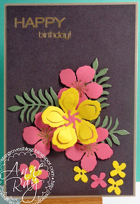
I have opted for black space and used Stampin' Up dies and stamps. I've gold embossed the card centres and added a Simon Says gold embossed sentiment. I love these flowers against a black background, it reminds me of canal boats and their decoration.
Followers
Saturday, 2 April 2016
"Less is More" - Challenge #270 - Colour
I have opted for black space and used Stampin' Up dies and stamps. I've gold embossed the card centres and added a Simon Says gold embossed sentiment. I love these flowers against a black background, it reminds me of canal boats and their decoration.
Subscribe to:
Post Comments (Atom)

Your flowers look so happy in those bright colours Anne and the placement is super. You are so right....they are a definite reminders of canal boats.
ReplyDeleteSharon xx
A beautiful card, Anne. The flowers look so striking against the dark background. xx
ReplyDeleteYour gorgeous flowers work so well against the black background. Karen x
ReplyDeleteThis is so pretty and eye catching. It really is like the canal boats! I love the colour combo and the flower shapes. Thanks for the inspiration!
ReplyDeleteYour flowers really pop in these bright and zingy colours Anne. Love those die cuts!
ReplyDeleteChrissie xx
Ann, that is a stunning card !!
ReplyDeleteThese dies look gorgeous, Anne! Love the rich colours against the background :)
ReplyDeleteLove how the colors pop on this card. Great inspiration!
ReplyDeleteStriking, fun and so pretty Anne. Great use of not white 'white' space and a fantastic design. Sarah x
ReplyDeleteWhat an absolutely gorgeous card! Love the beautiful colors you used and that gold embossing is the perfect touch!
ReplyDeleteLove all the bright colours against the black background, just lovely,
ReplyDeleteSarita x
Loving these flowers in their bold colours. x
ReplyDeleteThose flowers really pop against the black background and now you say it remind me of canal boats too Anne!
ReplyDeleteFabulous card the pretty blooms look amazing against the black back drop, a beautiful bold design
ReplyDeleteMarie
Beautiful card Anne, love the contrast on black although on my monitor it looks brown equally fetching :D x
ReplyDelete